
In many projects, waiting room screens come last: they’re mounted on the wall “wherever there’s space,” connected on the fly, and the hope is that they’ll be enough to inform or entertain.
For those designing spaces—whether a hospital waiting room, a clinic, a university campus, or a corporate reception—this approach is a missed opportunity: displays aren’t accessories, but design elements that interact with layouts, flows, and queue management systems.
In this article, we’ll look at how to think about waiting room screens from the concept stage: where they make sense, what they need to display, and how they can work alongside queue management totems and digital signage to inform, direct, and reassure people waiting.
Screens in the waiting room: not an accessory, but a design element
The first choice isn’t “which TV to buy,” but “what role do screens play in the waiting experience?”
In a well-designed waiting room, displays and monitors become part of the architectural language: they help create order, direct the gaze, and make information and pathways legible.
Whether it’s an emergency room, a health center, a university front office, or a corporate reception, the principle is the same: the screen isn’t a picture hung on the wall, but a hub in a wayfinding and communication system.
And let’s not forget that a screen designed for video communication or digital signage isn’t just a TV: the requirements for durability, brightness, orientation, and remote management are completely different. Those who want to learn more about the difference can read the article dedicated to Monitors vs. televisions: why they are not the same thing at the point of sale.
From layout to view: where screens make sense
The key question for a designer is not “how many screens?”, but “where do people see them from and at what points in the journey?”
Some operational guidelines:
- Relationship with seating and walkways
Screens must be visible from the main waiting areas, without forcing uncomfortable twisting or unnatural postures.
A display perfectly centered on the reception desk but invisible to those seated makes little sense. - Heights and Distances
Display size, average viewing distance, and angle from seating are design variables, not details left to the installer.
In a small clinic, a well-positioned 43″ display may suffice; in a hospital atrium or university lobby, a 75″ display or a video wall may be needed to maintain readability. - Light and Reflections
Large windows, direct light, and glossy surfaces affect readability: it’s better to work on positioning and tilt during the concept phase than to “turn off” a display because it reflects too much.
For larger spaces, it’s often more effective to distribute multiple medium-sized screens in strategic locations or design a well-positioned digital wall/video wall, rather than a single, distant, and difficult-to-read display.
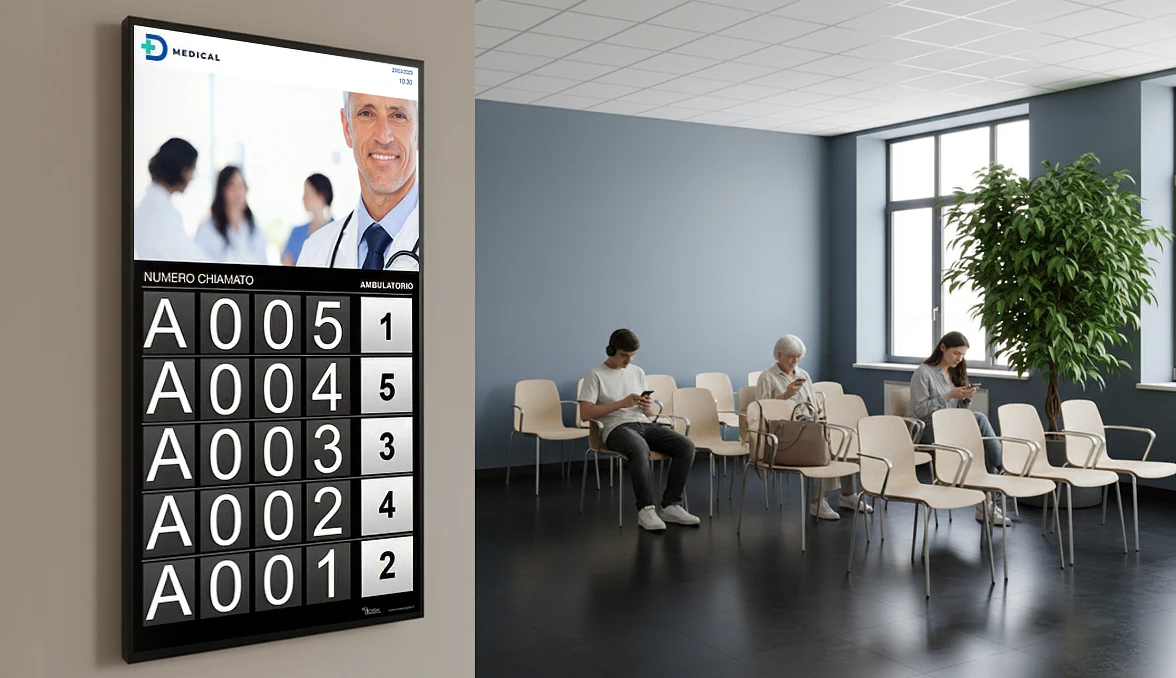
Screens and queue management kiosks: inform, organize, direct
Screens unleash their full potential when combined with a digital queue management system.
- The queue management kiosk is where people “enter” the system: they register, choose a service, and receive a number.
- The waiting room screens are the visible extension of that logic: they show who’s called, where they need to go, and what happens next.
This way, the waiting room feels organized: fewer questions at the desk, fewer spontaneous micro-queues, and greater clarity about “who’s next” and “where I need to go.”
As we saw in the article dedicated to designing queue management kiosks as an architectural element, the registration point must be considered from the early concept stages, along with the waiting room’s flow and layout.
Screen types and configurations by context
Not all waiting rooms require the same solutions: context guides the choice of display type and configuration.
- Small clinic or practice
One or two well-positioned displays are often sufficient to display calls, practical information (schedules, required documents), and a minimum of contextual content. - Complex healthcare facility or hospital
A combination of room screens, corridor displays, and digital wayfinding points is needed to navigate between departments, floors, and blocks.
Here, screens also support flow management, reducing the feeling of confusion. - University campus or multi-story corporate building
It makes sense to work with information totems and screens on each floor, digital directories, and, in lobbies, video walls that convey the campus or company’s identity.
Waiting rooms become hybrid spaces combining reception, information, and orientation. - Presidential reception areas
In these contexts, video walls and large-format screens are geared towards creating a “wow” effect and telling the brand story, without losing their basic information function (calls, meetings, guests, events).
The key is always the same: choosing the right screen type isn’t just a technical decision, but a design one.
Consider screens already in the concept phase
To prevent displays from being “hung” after the project is completed, it’s helpful to integrate them in the early stages:
- Insert them into layouts and renderings
Visualizing screens in the floor plan and views helps verify sight lines, proportions with respect to furnishings, and overall aesthetic impact. - Plan the correct arrangements
Power, network, ducts, brackets, and fixing points must be sized and positioned precisely, not “off-the-shelf.”
This avoids extension cords, exposed cables, and improvised solutions. - Integrate screens into the architectural skin
Boiserie, recessed installations, and custom-made structures can hide wiring and transform displays into an organic part of the wall, not a resting object.
Totems, screens, and software truly work only if designed together with the space designer, not after the project is finished.
Image and perception: the waiting room as a business card
The quality of screen integration directly contributes to the perception of the space:
- A makeshift screen, with exposed cables and random content, conveys carelessness and a lack of direction;
- A series of well-positioned displays, consistent with the design and synchronized with the queue management system, conveys order, efficiency, and attentiveness.
In competitive environments—large healthcare facilities, corporate headquarters open to the public, campuses—the waiting room and transit areas are often the first real physical touchpoint with the brand: the way screens are used is as much a part of the image design as materials, furnishings, and lighting.
If you’re interested in understanding how to simplify the daily management of content on monitors and video walls, you can find a complete overview in the article on digital signage software for waiting rooms.
 |
Need help?If you’re looking for an experienced partner to help you consistently integrate To incorporate screens, queue management kiosks, and digital signage into your projects, you can schedule a call with one of our Kiosk specialists: we’ll work together on layouts, technologies, and technical guidelines to immediately incorporate into your designs. |
|
Do you need help?If you are at If you’re looking for an expert partner to help you seamlessly integrate screens, queue management kiosks, and digital signage into your projects, you can schedule a call with one of our Kiosk specialists. We’ll work together on layouts, technologies, and technical guidelines to immediately incorporate into your designs. |


