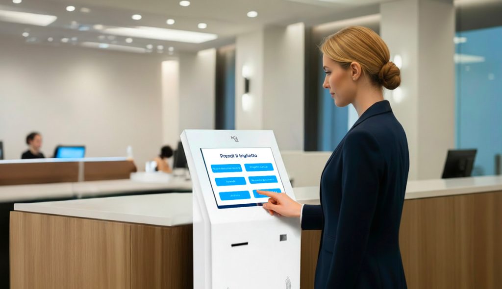
Many touch kiosk and digital signage projects begin with high expectations, but in practice, they end up underutilized or even ignored. The devices are installed, turned on… and then left there, like simple pieces of technological furniture.
The problem is rarely the technology.
More often, it’s a lack of experience design: unclear objectives, unsuitable interfaces, content not conceived for the real-world context.
Designing an effective touch kiosk means designing a digital touchpoint, not just installing hardware.
It’s no coincidence that the most successful applications—like McDonald’s self-service kiosks or wayfinding systems in international airports—demonstrate that the value of the kiosk comes from the touchpoint design, not the hardware.
Let’s look at the 5 most common mistakes in interactive kiosk projects—and how to avoid them.
Mistake 1 – Thinking of the kiosk as just “hardware”
One of the most common mistakes is to consider the touch kiosk as a simple physical object: the model is chosen based on price, size, or design, without a real usage strategy.
The result is an aesthetically pleasing kiosk without any real function, generating no interactions, data, or measurable value.
Typical signal:
The kiosk is turned on and visible, but is used very little or only sporadically.
How to avoid it:
- Start with the business objectives, not the device: reduce queues, provide information, generate leads, support staff, direct flows.
- Define clear KPIs from the start (number of interactions, average usage time, completed actions, contacts collected).
- Design the kiosk as a measurable digital channel, not as a one-off project.
Mistake 2 – Confusing and not very “touch-friendly” interface
Many interactive kiosks adopt interfaces designed for desktops or traditional websites: small text, tightly spaced buttons, complex menus.
But kiosks are used standing up, often in a hurry, in crowded or noisy environments. In these contexts, every friction becomes an obstacle.
Typical sign:
Users initiate an interaction but abandon it after a few seconds.
The most effective examples—such as self-order kiosks or airport wayfinding kiosks—feature extremely simplified interfaces, with guided paths and choices minimized.
How to avoid it:
- Design a specific UX for touch kiosks: few steps, large buttons, clear and direct language, guided paths.
- Minimize simultaneous choices: fewer options, more clarity.
- Test the interface with real users (customers, visitors, internal staff), observing where they get stuck or hesitate before going live.
Error 3 – Static, generic, or out-of-date content
A touch kiosk is designed as an interactive tool, but it’s often filled with static content: corporate videos, institutional presentations, and the same old promotional messages.
This quickly causes the kiosk to lose value and be perceived as a simple advertising screen.
Typical sign:
After the first few weeks, interest drops dramatically.
In the Decathlon stores — digital touchpoints work because they offer useful services: product research, availability, technical information, and purchasing support.
How to avoid it:
- Design content specifically for the totem: micro-services, maps, wayfinding, configurators, operational FAQs, reservations, check-in.
- Think of content as a service, not a showcase.
- Plan a digital signage editorial calendar, with updates consistent with seasonality, campaigns, and the physical context.
Mistake 4 – Incorrect placement and context of use
Even the best interactive totem fails if placed in the wrong place: hard-to-see areas, reflections on the screen, poor lighting, narrow passages, or a lack of clear directions.
In other cases, the totem is highly visible but not integrated into the user’s natural path.
Typical signal:
People walk past the totem pole without noticing it or knowing what to do.
In large transportation hubs—like airports and stations—touch kiosks work because they’re positioned at real-time points of need: where people stop, wait, or look for information.
How to avoid it:
- Analyze the physical customer journey: where people stop, where they ask for information, where they wait or queue.
- Place the kiosk at real-time points of need, not just where it “looks good.”
- Pay attention to signage and visual language: simple messages (“touch the screen,” “search here,” “check in”), clear icons, and brand consistency.
Mistake 5 – Underestimating maintenance, support, and data analysis
Many interactive kiosk projects lack a structured maintenance, monitoring, and data analysis plan.
When something doesn’t work, response times are extended and, more importantly, the opportunity to understand what’s really working for the user is missed.
Typical sign:
The kiosk remains unused for days or weeks without anyone noticing.
In more structured corporate contexts, reception and check-in kiosks are integrated into measurable processes: access times, flows, actual usage.
How to avoid it:
- Provide ongoing monitoring and support: remote control, software updates, performance, touch, and connectivity checks.
- Analyze usage data (touches, paths, most viewed screens, abandonments).
- Use this information to continuously improve the interface and content, transforming the kiosk into a living, evolving channel.
The real mistake to avoid: thinking of the kiosk as a “finished” project
The most successful applications—from restaurants to retail, to public and corporate spaces—demonstrate that an effective kiosk is an evolving channel.
It improves over time, adapts to people’s real behaviors, and grows thanks to data.
Treating it as a static installation means giving up the most valuable part of its potential.
The interactive kiosk is just the starting point
Providing a kiosk isn’t about solving a problem. True value arises when the project is designed around the customer: their flows, their spaces, their operational and communication objectives.
The integration of hardware, software, content, and data is what transforms a kiosk into an effective digital touchpoint, adopted by users and improved over time.
It is this design approach that distinguishes a long-lasting solution from a simple installation.
 |
You are evaluating a totem Touch?Before choosing hardware, interface, or content, it’s worth taking a step back and thinking about the project as a whole. A discussion with an expert helps clarify objectives, context, and actual impact, avoiding errors that only emerge after installation.
|


